ShopDreamUp AI ArtDreamUp

Deviation Actions


Description
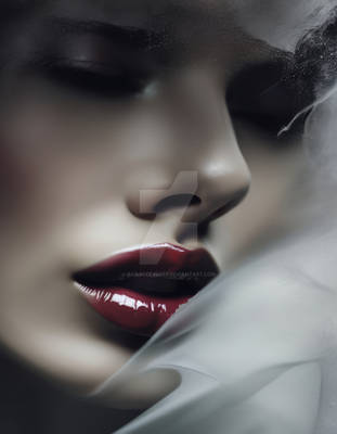
Need to keep my sanity somehow... haven't done much in Photoshop lately, so busy! Hope you'll all like it ^^
---
Stock ~mjranum-stock
Model miss-mosh
---
Stock ~mjranum-stock
Model miss-mosh
Image size
1968x1655px 727.29 KB
Make
Canon
Model
Canon EOS 5D
Shutter Speed
1/128 second
Aperture
F/19.0
Focal Length
73 mm
ISO Speed
50
Date Taken
Mar 23, 2008, 7:20:55 AM
Sensor Size
16mm
© 2011 - 2024 rosalindharrison
Comments8
Join the community to add your comment. Already a deviant? Log In
I couldn't find the original piece, but i'd really love to see it so I could know what all you did here. I'll say upfront it reminds me of Lady Gaga, but in a good way.
I think less dead space could make it a more powerful piece. The wierd purple circle is something I could personally do without, or i think could be less prominant.
What I do like is the subtle colours and the angle at which she's leaning. This is a good example of how you can break a compositional rule and get away with it - in fact it's day you added to it.
This is the kind of thing that I'm going to see as someone's feature deviation that's going to make me stop and look at their entire gallery.